Rufus
Rufus
Rufus
Generative AI-powered shopping CX
Generative AI-powered shopping CX
Generative AI-powered shopping CX
Contributed to core CX patterns, led design for product comparisons and shoppable components, and learned how to navigate a high-visibility project.
Contributed to core CX patterns, led design for product comparisons and shoppable components, and learned how to navigate a high-visibility project.
Contributed to core CX patterns, led design for product comparisons and shoppable components, and learned how to navigate a high-visibility project.
Duration 📅
Duration 📅
April 2023 – November 2024
April 2023 – November 2024
April 2023 – November 2024
Partners 👥
Partners 👥
UX Designers, Conversation Designers, Product Managers, Engineers, Scientists
UX Designers, Conversation Designers, Product Managers, Engineers, Scientists
UX Designers, Conversation Designers, Product Managers, Engineers, Scientists
Overview
Overview
Rufus is an expert shopping assistant trained on Amazon’s product catalog and information from across the web to answer customer questions on shopping needs, products, and comparisons, make recommendations based on this context, and facilitate product discovery in the same Amazon shopping experience customers use regularly.
Rufus is an expert shopping assistant trained on Amazon’s product catalog and information from across the web to answer customer questions on shopping needs, products, and comparisons, make recommendations based on this context, and facilitate product discovery in the same Amazon shopping experience customers use regularly.
Rufus is an expert shopping assistant trained on Amazon’s product catalog and information from across the web to answer customer questions on shopping needs, products, and comparisons, make recommendations based on this context, and facilitate product discovery in the same Amazon shopping experience customers use regularly.
Here's a glimpse of what I worked on during my time with the Rufus design team. 🖊️
Here's a glimpse of what I worked on during my time with the Rufus design team. 🖊️
Disclaimer: All opinions below are my own and do not reflect Amazon or its partners. This is a personal portfolio describing my own point of view of my contributions as part of launches.
Disclaimer: All opinions below are my own and do not reflect Amazon or its partners. This is a personal portfolio describing my own point of view of my contributions as part of launches.
01
01
Product Comparisons
Product Comparisons
April '23 – November ‘24
01
Product Comparisons
April '23 – November ‘24
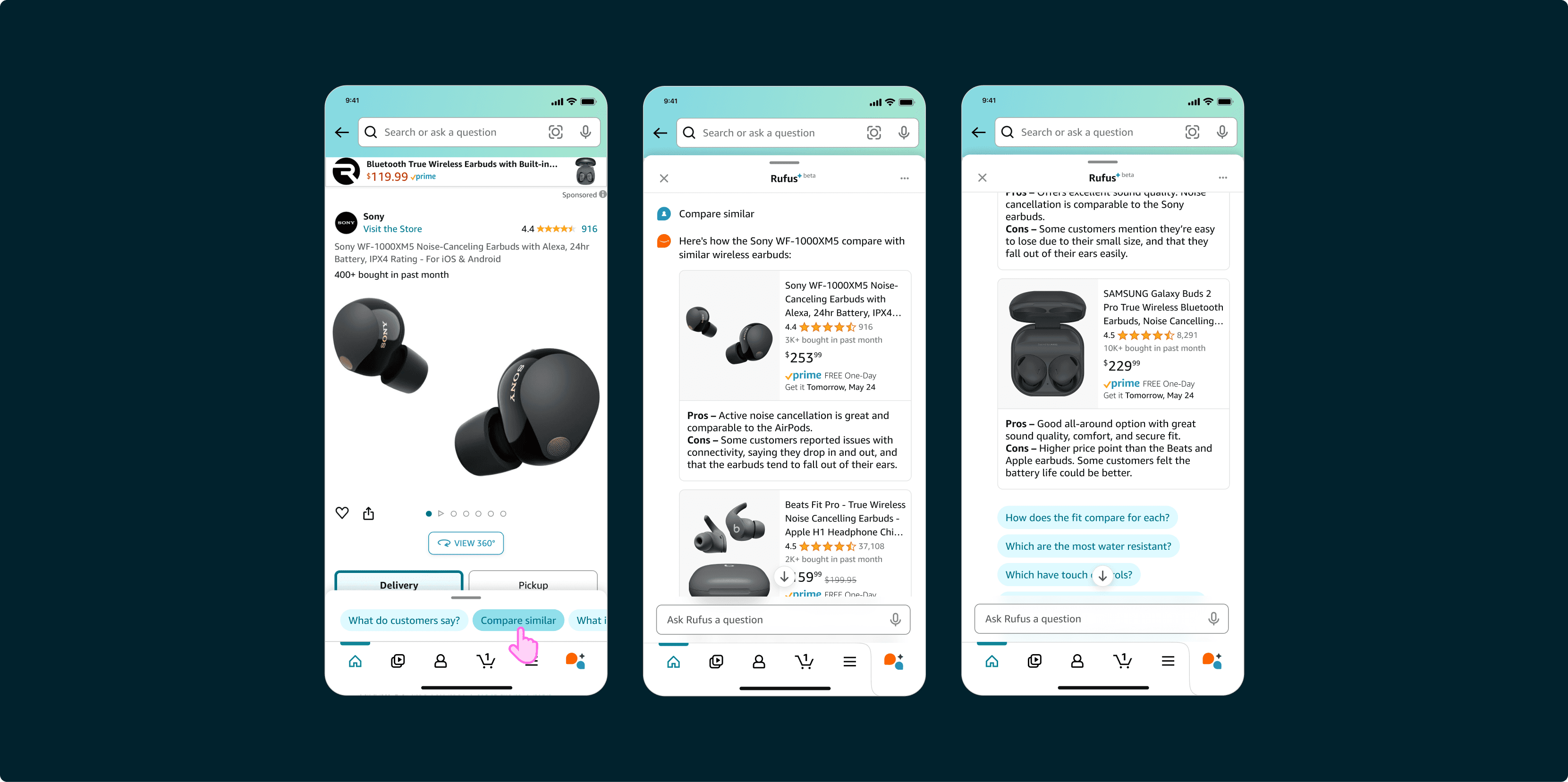
I owned comparisons throughout my entire tenure, and is where I feel I gained invaluable experience as a design owner.
I owned comparisons throughout my entire tenure, and is where I feel I gained invaluable experience as a design owner.
I owned comparisons throughout my entire tenure, and is where I feel I gained invaluable experience as a design owner.
When I joined the team in June of 2023, I had to learn quickly what it meant to be a sole design owner for a critical shopping vertical. I collaborated with user research to inform design decisions and partnered with product managers to build a strong CX strategy. I also worked closely with the personalization team at Amazon to integrate comparison experiences across multiple platforms, leading to a multiple design proposals presented to VP-level executives.
When I joined the team in June of 2023, I had to learn quickly what it meant to be a sole design owner for a critical shopping vertical. I collaborated with user research to inform design decisions and partnered with product managers to build a strong CX strategy. I also worked closely with the personalization team at Amazon to integrate comparison experiences across multiple platforms, leading to a multiple design proposals presented to VP-level executives.
02
02
Shoppability
Shoppability
June 2023 - May 2024
02
Shoppability
June 2023 - May 2024
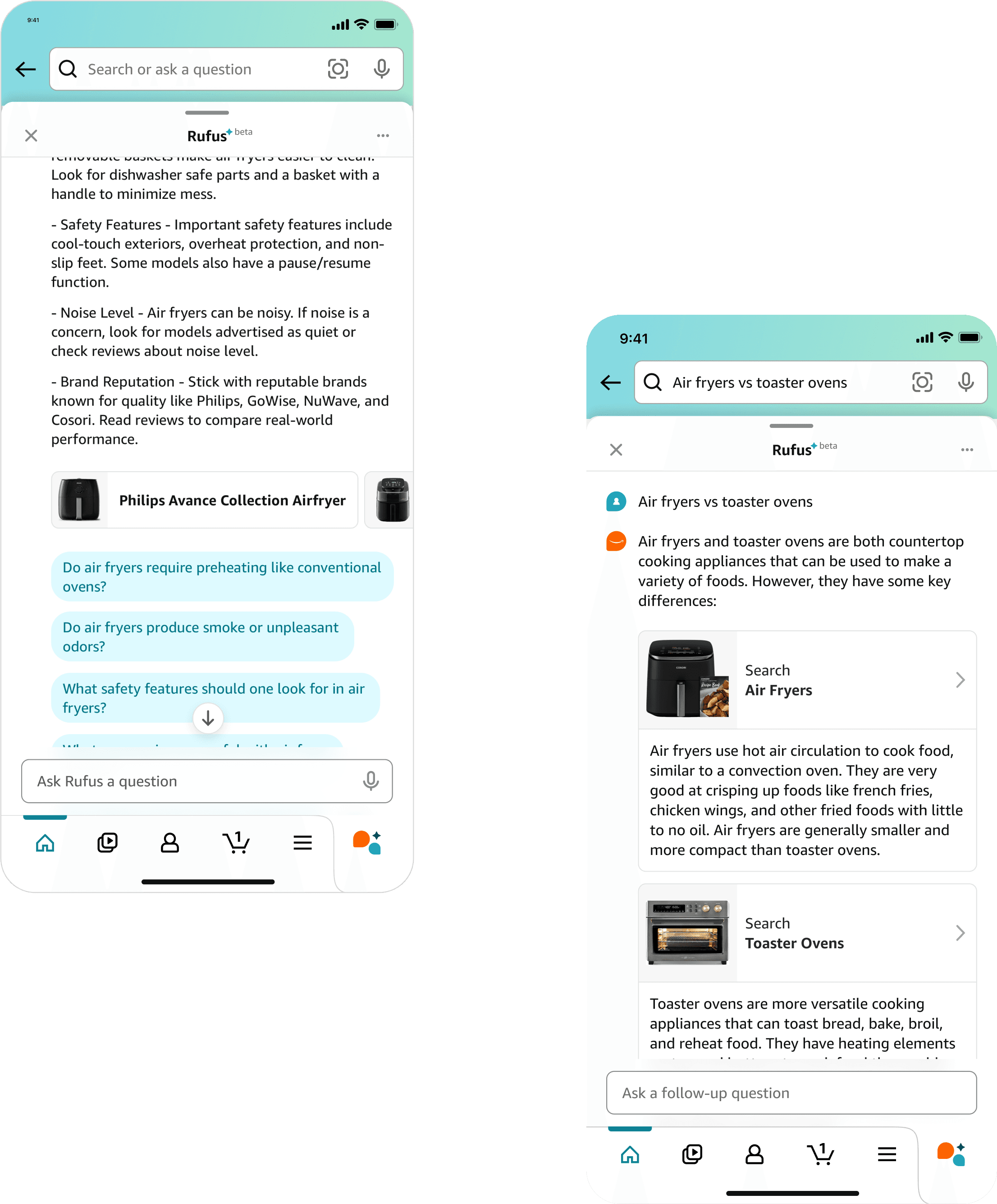
I created "category cards" a key component of the Rufus experience, enabling a seamless transition between Rufus and search.
I created "category cards" a key component of the Rufus experience, enabling a seamless transition between Rufus and search.
I created "category cards" a key component of the Rufus experience, enabling a seamless transition between Rufus and search.
Coming out of a CEO presentation in June 2023, leadership identified a need to improve customer navigation within product categories. I conceived and designed category cards to address this need and request from executive leadership. After receiving buy in from our director and CEOs, I refined the component based on beta testing feedback and collaborated with engineers to implement it for the initial launch where it still remains in the CX today.
Coming out of a CEO presentation in June 2023, leadership identified a need to improve customer navigation within product categories. I conceived and designed category cards to address this need and request from executive leadership. After receiving buy in from our director and CEOs, I refined the component based on beta testing feedback and collaborated with engineers to implement it for the initial launch where it still remains in the CX today.
As the component owner I learned how to design across a broad horizontal that impacted various teams, and learned how to collaborate with partners to drive improvements.
As the component owner I learned how to design across a broad horizontal that impacted various teams, and learned how to collaborate with partners to drive improvements.
As the component owner I learned how to design across a broad horizontal that impacted various teams, and learned how to collaborate with partners to drive improvements.
I realized that a "one size fits all" approach for category cards wouldn't work, and that their need to be different variations of the component. I developed a dynamic framework that could present different versions of the category card, so that responses would better fit different query types. I collaborated and reviewed with cross-functional teams, and ensured that the framework met both my partners needs, customer needs, and technical requirements.
I realized that a "one size fits all" approach for category cards wouldn't work, and that their need to be different variations of the component. I developed a dynamic framework that could present different versions of the category card, so that responses would better fit different query types. I collaborated and reviewed with cross-functional teams, and ensured that the framework met both my partners needs, customer needs, and technical requirements.
03
03
Second Input Field
Second Input Field
December 2023 - January 2024
03
Second Input Field
December 2023 - January 2024
I learned what can be accomplished when you have efficient teamwork, clear communication, and empathy with your engineering partners.
I learned what can be accomplished when you have efficient teamwork, clear communication, and empathy with your engineering partners.
I learned what can be accomplished when you have efficient teamwork, clear communication, and empathy with your engineering partners.
Originally the search bar was meant to be a duel input field for both standard search and Rufus. However, after a relocation of the search bar back to the top of the Amazon app in December of 2023, customers quickly became confused about how to input their own queries into Rufus.
With this as a sudden issue right before launch, executive leadership accelerated the timeline for a solution and gave the team one week to present a fully functioning version of the app with a second input field to demo with the CEO.
Our principal designer picked me to be a part of a small team that would design it. As a key contributor, I actively participated in daily cross-functional meetings, rapidly generating multiple high-fidelity concepts, and collaborating closely with engineers to ensure seamless integration by our deadline.